
About the author
Emma Russel is the founder of Oxford Comma, a new search-first digital agency. An SEO with over a decade of experience helping start-ups and household name brands capitalise on and increase demand.
And speaker at industry events including BrightonSEO, Women in Tech SEO, RemoteSEO and ReadingSEO.
Make sure you connect with Emma on LinkedIn.
It’s not uncommon that when engaging a new client or starting somewhere new, we find that 99% of traffic coming to the website is from brand keywords and people mostly land on the homepage.
As SEOs we’re trained to capitalise on demand for more than just the brand name and look towards generic traffic.
We make sure people are aware of the opportunity and get buy-in to capture brand traffic, increase our share of generic traffic, and hopefully at the same time, with the help of UX designers, merchandising teams, developers and copywriters, get more conversions as well.
In fact, it’s often our North Star Metric and we use other KPIs like increased traffic to relevant landing pages to show progress.
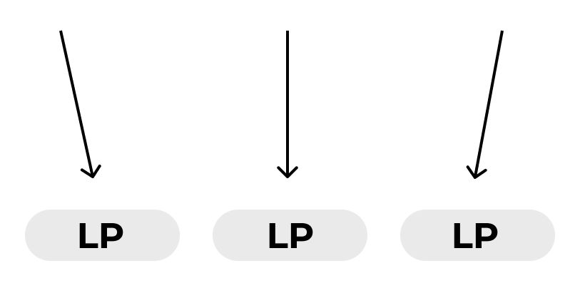
And so we set to optimise landing pages to capture traffic for a whole host of generic keywords. The more topics we want to target the more landing pages we need and so we optimise for entrances to the site. The more entrances, the more traffic, the more conversions.
However, people we work with outside of marketing, like developers and designers think of the site differently, they think of landing pages as conduits.

Landing pages can lead to multiple different journeys depending on needs and persona, all of which are ultimately shaped towards conversion. The more efficient the conduit, the higher the conversion rate, the more conversions.
It’s this difference of thought between optimising pages as either an entrance or a conduit that can lead to clashes and impasses between teams. But this doesn’t need to be the case if we optimise for both, as our North Star Metric ultimately requires.
Let’s look at an example of how these different ways of thinking about a website can impact the decision-making on an e-commerce website that sells tickets to activities for children.
The first thing a user sees when encountering the website is a search bar. The search bar area takes up the entire space above the fold, with the exception of a simple menu that contains links to a page targeted towards parents, one for suppliers, an about page, and blog.

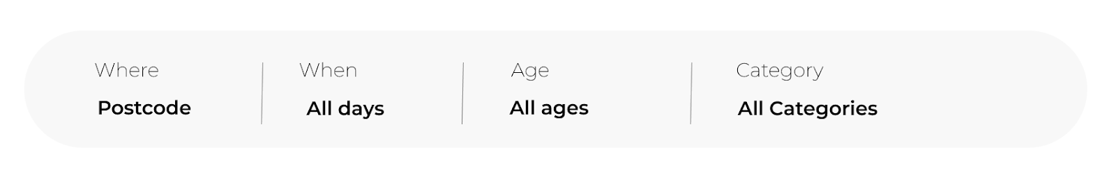
In the search bar you can add your location, category of event you’re looking for, and then press enter to be taken to an events listing page that shows all of your local events in that category. There is also additional information you can add in the search function that isn’t mandatory, for example, age. The listing pages you’re taken to, having filled in the info you want, are on a subdomain that isn’t indexed.
You may already be full of ideas, pointing out that the listing pages aren’t indexable and we can capture a lot of generic traffic through these pages. However, we’re going to put on our UX hat on here for a moment to understand why it may have been originally set up this way.
The first thing I think we can all agree on is that a search bar is often the most efficient way to find something, as long as it’s set up correctly. We don’t want to be adding extra steps for people to find something so the search bar has to stay and this is a great addition to the page. It’s the fastest route to conversion.
We also know we don’t want people to be too distracted from this search bar and so we don’t want too much extraneous information distracting them from their purpose of finding events in their area. Hence a relatively simple menu and the search bar taking up the above-the-fold space.
Here’s an example of a website that’s made that initial input even simpler:

As a UX professional, I’ve ticked two things off my list, I’ve created a homepage that’s a GREAT conduit to the listing pages and from there, people are a couple of clicks away from purchase.
As an SEO professional, it’s important to take a learning from this, they’ve created the most efficient way to purchase, and, in e-commerce, our North Star Metric is conversions! But we aren’t UX professionals, we’re SEOs, we optimise for traffic as well. And that requires more landing pages that target terms that the listing pages can target, it requires inlinks to make sure Google can find and index the pages, and preferably people will use them, so we need to also make sure that the links are discoverable and useful to people browsing the website.
And so we have our first impasse. The menu.
A UX professional doesn’t want people to be distracted from the easiest route to purchase but the SEO professional needs to link to the new landing pages they’ve got so needs a journey, preferably via the menu. So we have two requirements of the site, with ultimately the same, aim — more conversions, but different ways to achieve that purpose and in doing so, create two potential journeys on the homepage vying for attention, rather than one cohesive journey.
This is an example of that in action on an events website:

But how do we overcome this? From here we’re journeying into the often-asked question “how do we improve relationships with developers?”, or in this case designers, which inevitably leads to the statement that it takes two to tango, and this is true, you will be reliant on a good relationship with the UX team and developers to get your requirements over the line or to come to a resolution. I often find that the best route to understanding is a shared goal. And you have one! Conversions. The second is the acknowledgment of good work well done and the search bar on the homepage is a fantastic route to purchase so you have this too.
From here, you can work together on a shared aim and you can ask questions for both of you to put answers together for a shared outcome such as “what is a better route to purchase? The blog in the menu or a drop-down of locations or category listing pages?”, “How should we organise location structure to best have inlinks but create a good experience?”, “Are we present in enough locations to have this link in the menu?”, “Should we prioritise a category journey?”, “Can we use the footer?”, “Can we create secondary navigation that sits below the search bar?”, and so on. And by doing so, you can come to a conclusion that works for both schools of thought.
By thinking of the two roles of landing pages this way, as both entrances and conduits, it can help lead to better understanding between teams around why you might have different suggestions to attain the same outcome — more conversions. SEOs want more traffic to ultimately increase conversions, UX designers shape that traffic to increase conversion rate. Different requirements of the site, different ideas. In understanding each, you can work together to come up with other solutions for the goal.
About the author
Emma Russel is the founder of Oxford Comma, a new search-first digital agency. An SEO with over a decade of experience helping start-ups and household name brands capitalise on and increase demand.
And speaker at industry events including BrightonSEO, Women in Tech SEO, RemoteSEO and ReadingSEO.
Make sure you connect with Emma on LinkedIn.